service in a
mobile-first
world.
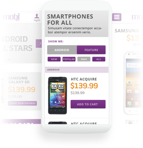
The project involved in-depth stakeholder & customer research which lead to a mobile-first strategy, user experience design exercises to flesh out the task flows through the site, and front-end development to create complex UI interactions for creation and purchase of family phone plans online.
The end result was a highly performant, mobile first web application with increased YOY mobile traffic of ~300% and a significant decrease in calls to customer support.
Due to their lower than normal pricing, the brand was also actively fighting the stigma of being the “cheap phone guys” and only servicing low income customers. The previous website featured a legacy, fixed-width design (ie. no mobile support) and included multiple pain points in their product purchase and bill-payment user flows.
Additionally, the client was also interested in expanding the “self-care” portion of the site, allowing users to perform common account-level tasks online (ie. bill payment, upgrade their phone, add a new line/phone number, etc.).
doesn’t mean
low quality.

The Process
During the discovery process, I lead several rounds of interviews, including stakeholder interviews with executive management, regional managers, store managers, customer care representatives, and store associates, as well as interviews with customers on-location (i.e., in-context).
I also completed two rounds of user surveys, sent via text message to ~5000 customers to gather quantitative data, with ~1000 responses. We then developed user personas based on the quality & quantitative information we received directly and indirectly during the interview process.
As previously noted, the Discovery process uncovered a lot of very valuable information about the MobiPCS customer; below are a few of the insights we were able to pull together:
60% of their target audience made above the median-household income for the state of Hawaii, directly contradicting the stigma placed on them for being a cheap carrier for low-income individuals
Over 70% of current customers at the time used their smartphone as their primary device for accessing the internet.
A significant portion of the customer base (up to 30% at some locations) were non-native english speakers.
Once we had consensus from the stakeholders on the business problems we were solving, as well as the motivations of their customers, I proceeded to create user flows, mapping out the current navigational paths across the site and highlighted many pain points along the way.
After proposing improved user-flows, I then moved into creating mobile-first wireframes based on our insights from Discovery, where we learned their target audiences primary devices for accessing the internet is their mobile phones.
After approval of the site architecture and wireframes, I then began rapidly prototyping the more complex parts of the UI design in HTML/CSS/JS. Using AngularJS + Foundation Framework, I was able to quickly put together a testable, interactive prototype allowing test users to create Ohana (family) plans with multiple phone lines, plan options and add-ons, and devices, from browse to checkout.

Based on what we uncovered during the Discovery phase, our solution was based on a mobile first design strategy, with a user experience focused largely around mobile behavior.
Additionally, to accommodate the large percentage of non-native english speaking customer base, our content strategy focused on simplification as well as using iconography and other universal symbology to help direct users without a lot of text.
- Client: MobiPCS
- Agency: Ikayzo, Inc.
- Engagement: January 2013 — October 2013
-
Technology
- Frontend: AngularJS
- Backend: Ruby on Rails
- UX Design: Mike King
- UI Design: Arlyn Ramos
- Frontend Development: Mike King
- Backend Development: Chris Kobayashi, George Lee, Leo DeCandia